Vinhuset
I optimized their design for a more seamless and engaging experience for Vinhuset.dk – a brand dedicated to making quality wine accessible to people in Denmark.
The design was based on the Shopify e-commerce features.
The challenge was to improve the conversion rate by improve the user experience.
Vinhuset
Mercive agency (mercive.com)
Shopify
Figma
Adobe Photoshop
Content
01
02
03
01. From ideas to interactive prototype
Discovery
By using Desk Research I learned from other brands with strong user journeys.
I made a competitor analysis that showed how Vinhuset can differentiate and compete.
I also analysed data from Shopify Analytics to identify pain points on the user’s journey.
Define
Based on the learnings from the insights I made hypothesis’ to solve the UX problems and created a new user flow and sitemap to improve the user journey.
Design
I got feedback and made iterations based on the feedback on the early designs ideas.
In Figma I made a design system and designed high fidelity wireframes.
Prototype
I made an fully functional interactive prototype that was presented to stakeholders of the brand to showcase the improved website.
02. Simplified user flow and navigation
By simplifying the user flow, the sitemap and navigation system got improved to give the user quicker overview of the offers the website has and makes it easy for the user to:
– to find what the loyal customer is looking for or to navigate on the website.
or:
– to let the new visitor that doesn’t know the brand to explore the website and add products to cart with a quick buy function.


Engaging slider cart to complete checkout
Shipping bar
If the customer hasn’t bought enought to gain free shipping that the shipping bar is signaling, the user is encouraged to buy more from the upsell feature.
Slider cart
By improving the slider cart with relevant information in the end of the funnel the user gets the informations about delivery date and current offers to complete the checkout that will increase the conversion rate.
More leads from newsletter
The former newsletter was placed way down in the footer on all pages so the user could miss the opportunity to sign up the newsletter to get offers and more. By placing to the top of the newsletter up in the footer and making the value exchanges more visible it encourages the user to sign up and so the Vinhuset gets more leads and sales from the newsletter.

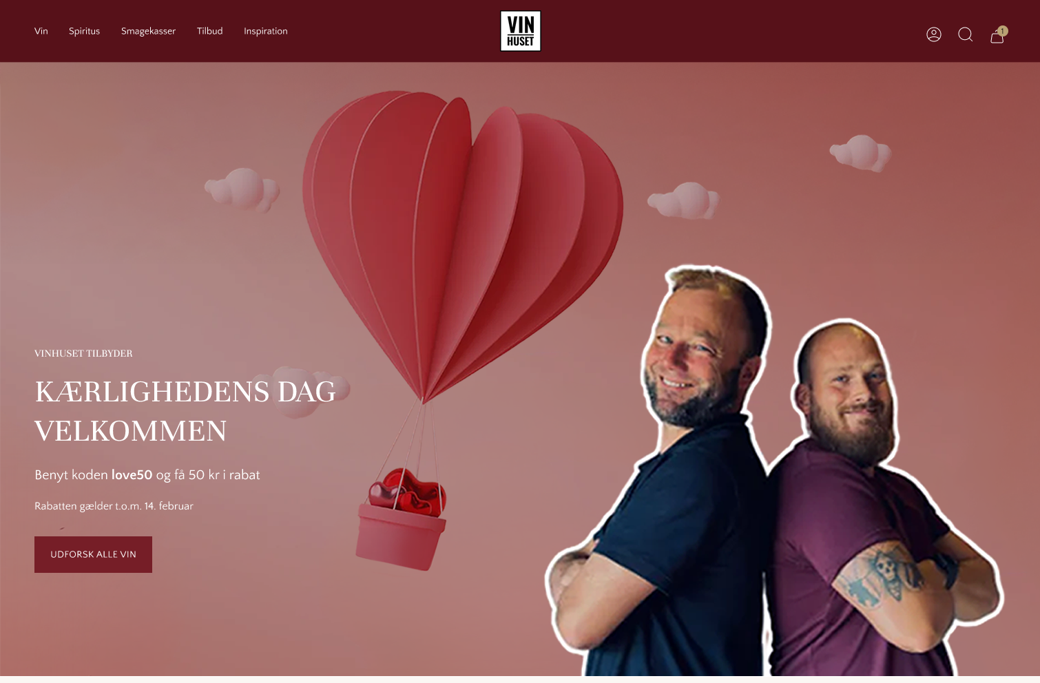
03. Redesign
Home page

Product page – “Smagekasser”


Product page – singles wines

