Flower webshop
We improved the website by giving it a new look and the customer journey so the website can attract new customers and keep them by convertion optimize the website for example a section to sign up to newletter etc.
By analysing the type of customer through qualitative and quantitative research, target group and lifestyle analysises we used the insights to optimize the website’s function and design. The two target groups are B2B (Business to Business) and B2C (Business to Customer).
Flower shop
Digital design
Visual identity
Student work
Figma
Adobe Photoshop
Wordpress (Bricks Builder)
Content
01
02
03
01. Design and business
I used Design Thinking throughout the project.
In the Define phase in the Design Thinking model I gained the insights about the customers by doing research about the users and made market, target group and lifestyle analyses to get picture of the two target groups: B2C customers in and B2B in Copenhagen. I made an as-is customer journey map to get an overview of touch points and pain points to improve the customer experience with a new and user friendly to-be customer journey.
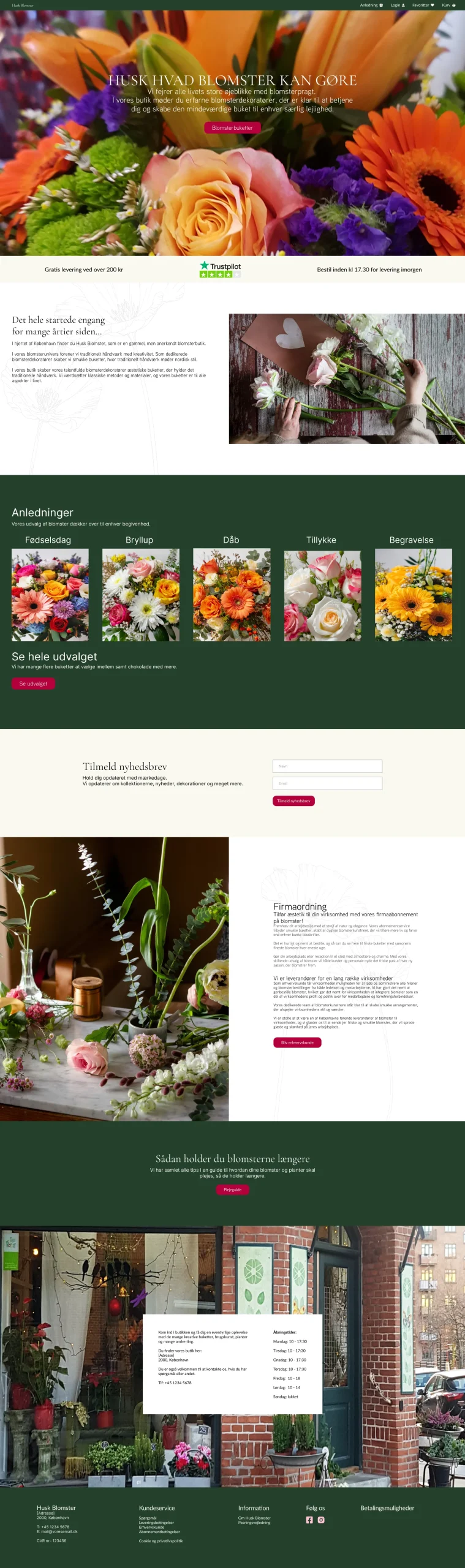
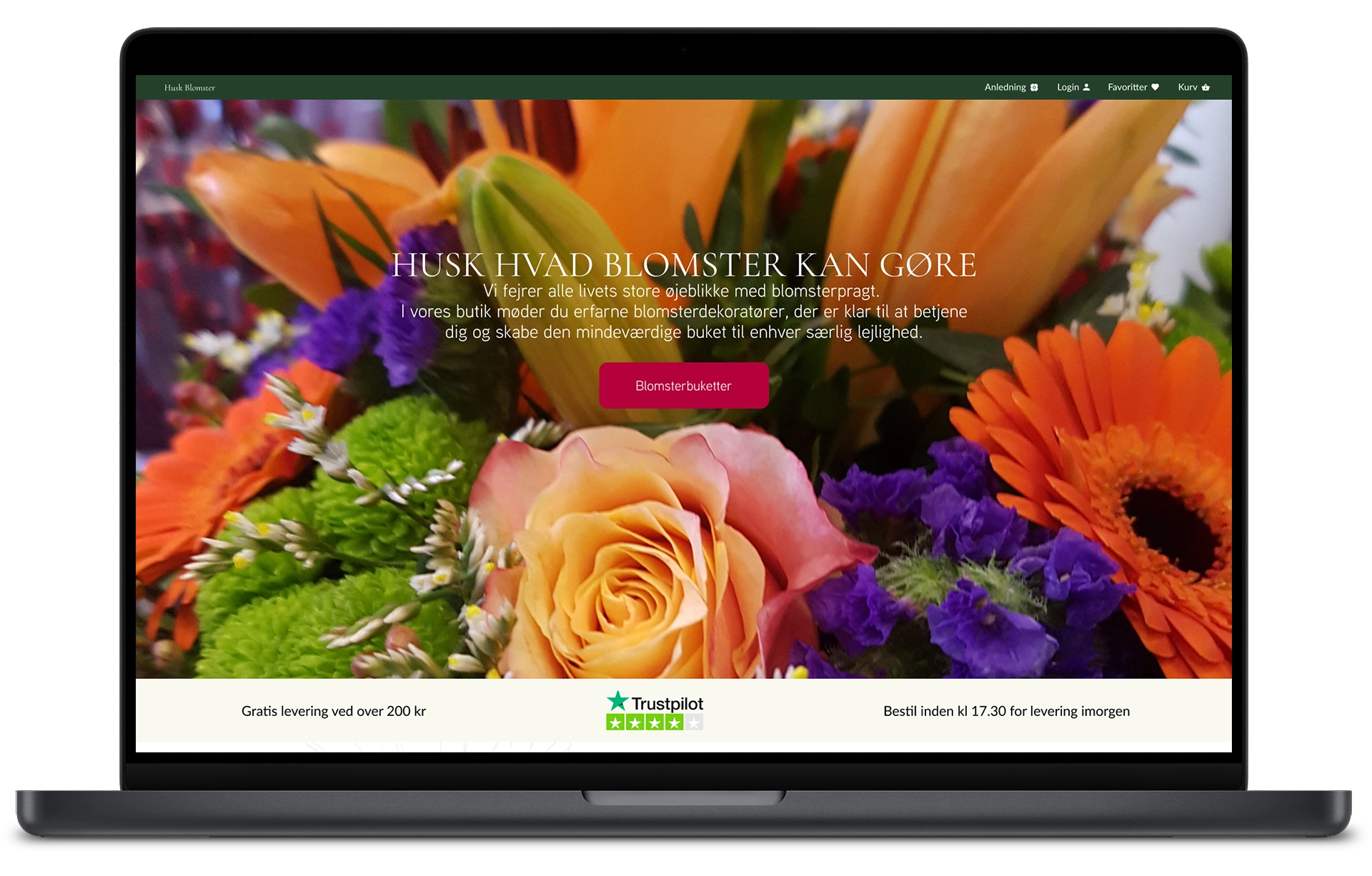
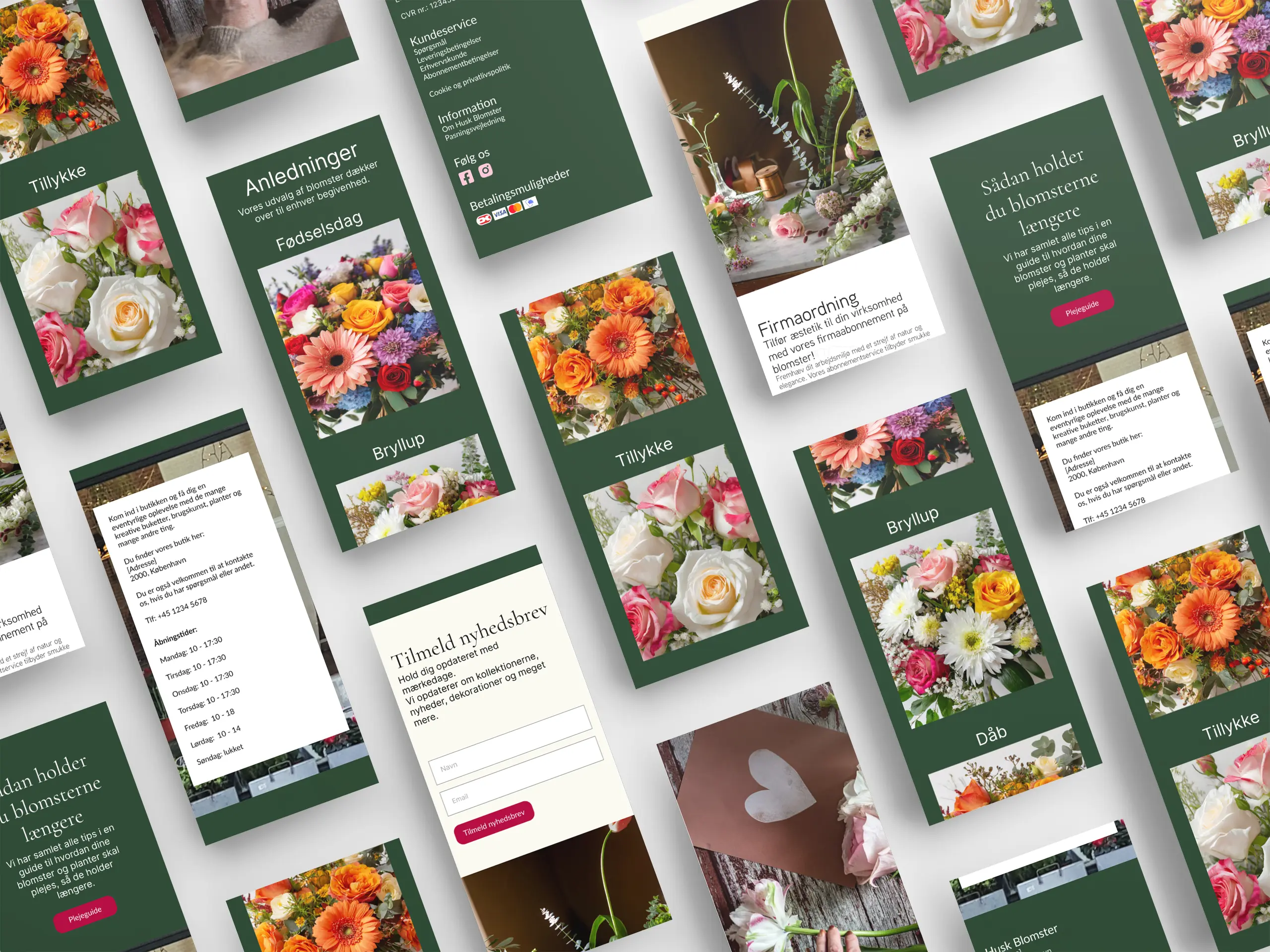
The design of the website got optimised to convert visitors to customers.
02. Visual identity
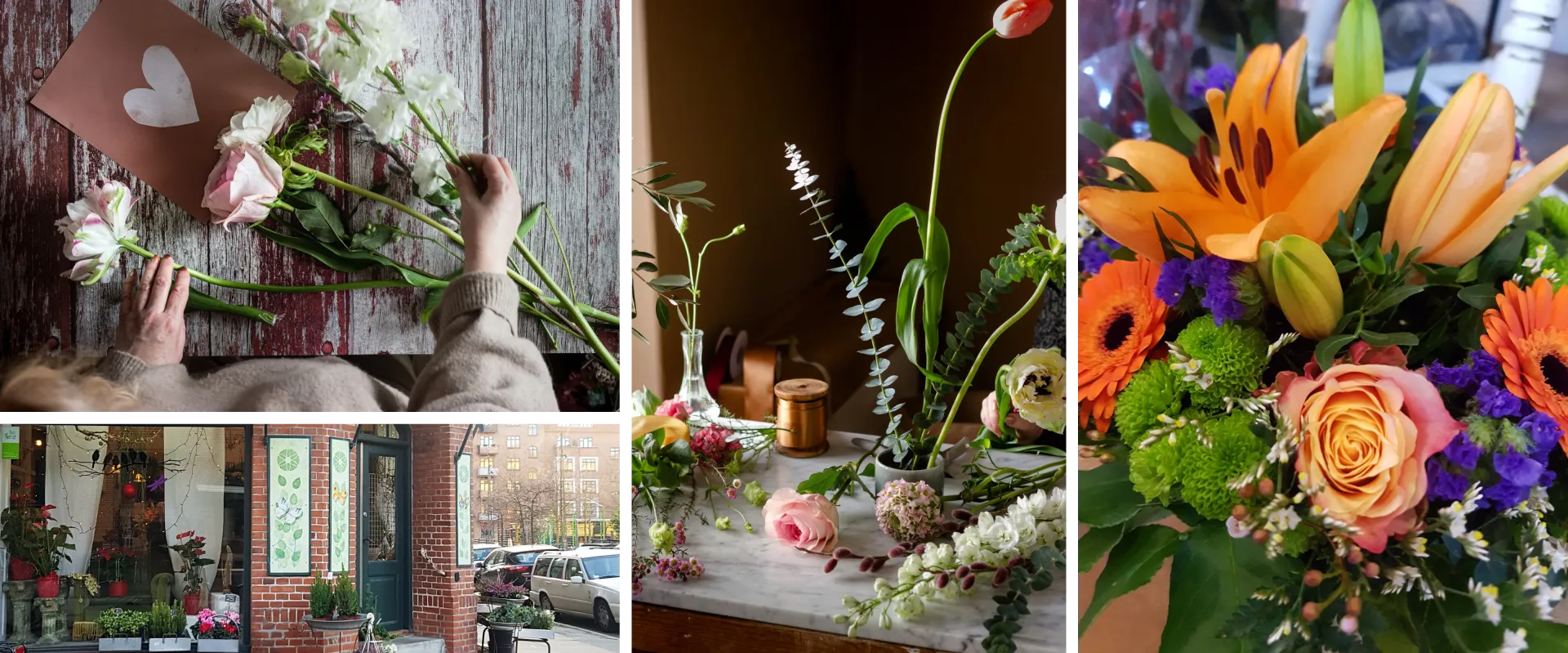
The design of the website is inspiration from traditional craftsmanship where there is pride in the handmade flower bouquets and the history behind the old flower shop.
Values
Quality, creativity, inspiring
Style
Authentic, traditional, beauty, simple
HEX: #D26C6C
HEX: #24412B
HEX: #F5F4E2
HEX: #FFFFFF
02.1 Craftsmanship
Tradition, authenticity, artwork, creativity, beauty.
Photos and illustrations of outlined flowers and plants in the background that emphasize the creative craftsmanship of creating beautiful flower bouquets.

03. Design system
I also checked that the text sizes and colours are WCAG friendly meaning that there is a good minimum text size and colour contrast so the texts are easy to read. That’s some of the ways to make sure that the users get a good user experience.
The images are in Webp format reduces size compared to the other well-known file formats so the website loads faster.